

Responsive Website Design Sri Lanka | Responsive Website Development Sri Lanka
Responsive Website Design & Development makes Websites Beautiful!
Responsive Design prepares websites for the future of modern website design by making them beautiful across multiple devices. Our team plans, designs, and develops stunning responsive websites that will increase conversion rates and overall traffic. We make sure that our responsive websites are beautiful across all devices. Responsive web design allows a website to adapt to and provide an optimal experience on any device it’s being accessed from. This means that your website should look and function flawlessly for a user on a desktop computer, laptop, tablet, or smartphone. If you are think about a new website design, make sure you build one that is a responsive website design, it can make all the difference!
Our responsive web design in Sri lanka makes sure that your business is prepared for the future mobile web.
Dimensions-IT is a progressive website design firm in Sri Lanka, that employs a team of experienced and talented designers who constantly upgrade their skills to stay abreast of the latest design trends and technological advances. Our responsive web design solutions facilitate effective and optimal content display across a wide range of desktop and mobile devices. We specialise in responsive website designs, using unmatched skills in the design and development of sites that can adjust automatically to various layouts and resolutions.
Responsive web design is officially recommended by Google as a best practice for web design to ensure cross platform compatibility.
With Responsive Web Design, your site will appear perfectly for a range of different devices, adjusting to the screen size that any visitor may be using. This ensures a better viewing experience for mobile users. As a market leading mobile responsive website design company in Sri Lanka, our experienced and skilled web developers at Dimensions-IT strive to produce user-friendly mobile websites that helps increase your conversion ratio. We are passionate about responsive development and our developers are always looking for new ways to enhance your end users responsive experience. Responsive website design requires expertise as they are a lot of design and functionality tradeoffs to consider. We have the capability of redesigning existing sites in order to integrate responsive design features that make them compatible with mobile devices.
Why Responsive Web Design in Sri Lanka?
- Seamless User Experience
- Increase Sales
- Increase SEO Value
- Save Time & Cost
Responsive Design prepares websites for the future of modern website design by making them beautiful across multiple devices.
Responsive Web Design aims at crafting websites to provide an optimal viewing experience across a wide range of devices. This means easy reading and navigation, with a minimum of resizing, panning and scrolling. Websites designed with Responsive Web Design typically have larger text, easy to click links, as well as the ability to resize in order to fit whatever screen they're viewed on. The websites we develop are completely responsive, meaning they automatically respond to any screen they are viewed on rearranging and resizing elements to provide a great user experience regardless of what device your potential client is accessing your website from. The better the user experience, the faster the visitor will navigate to the information they are looking for and ultimately take the plunge from a visitor to a customer.
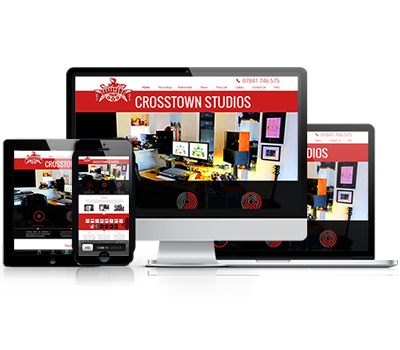
We Make Sure That Your Website Works in All Devices!
Every website we design and build is compatible with mobile & tablet, crafted with web standards to ensure compatibility across all standard platforms. The responsive web design method is fully integrated throughout our web design and development. Beginning with the user experience and visual design stages, we are already planning for how the site will work responsively. Dimensions-IT use responsive web design methods so your site scales and optimizes content seamlessly depending on screen size. From iPhone to iPad and everything else, your site will look like it was built for any device.

